
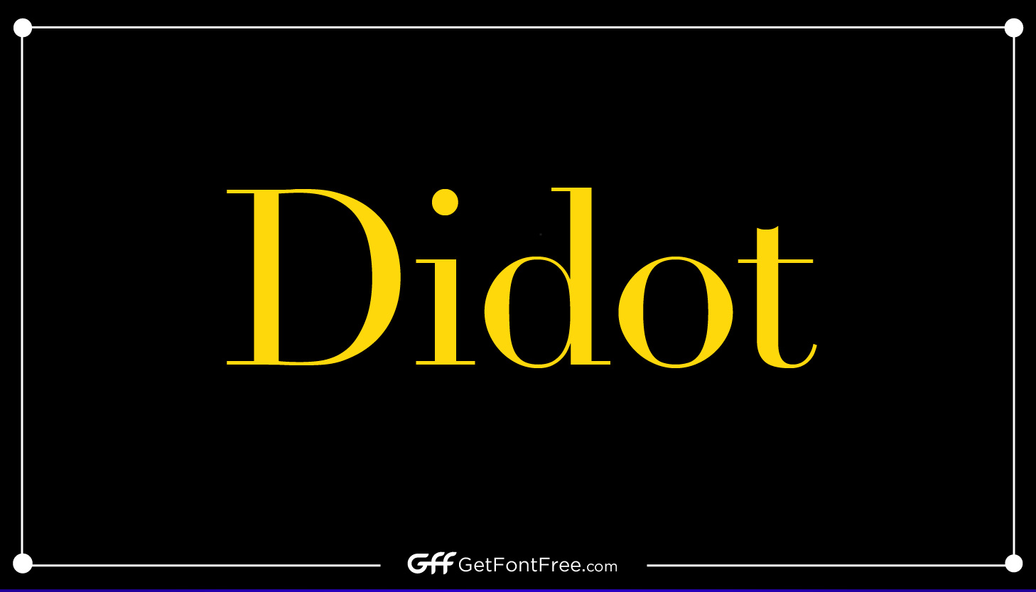
Didot Font, also known as simply “Didot,” is a typeface that originated in France during the late 18th century. It was named after the prominent French printing and typefounding family, Didot, who were renowned for their contributions to the field of typography.
The Didot family, consisting of several generations of printers, publishers, and type designers, played a significant role in the development of modern typography, and their work continues to influence contemporary design today.
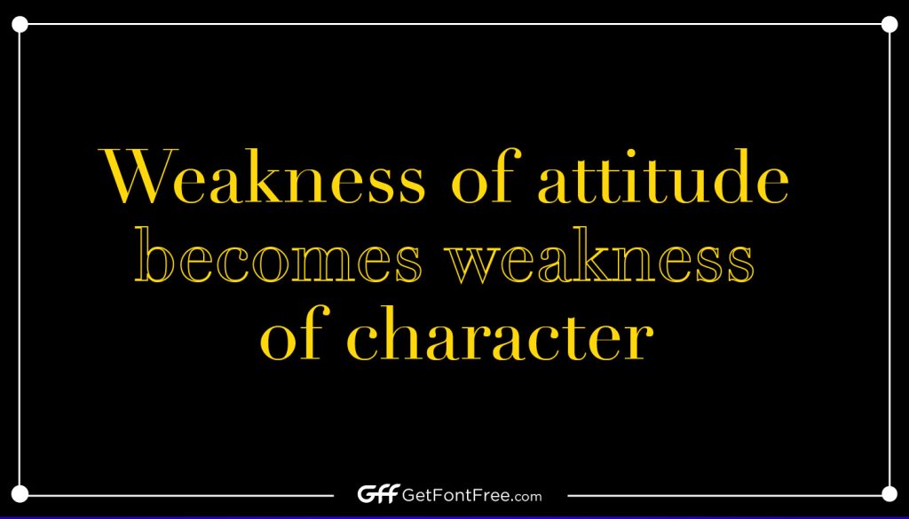
The Didot Font is characterized by its elegant and refined appearance, with its high contrast between thick and thin strokes, vertical stress, and sharp, fine serifs. It is known for its clean, geometric shapes and a sense of sophistication, making it a popular choice for high-end design projects, such as fashion magazines, luxury branding, and editorial layouts. The Didot Font has also been used in various editions of classic literature and art publications.

The history of the Didot Font dates back to the late 18th century when Firmin Didot, a member of the Didot family, first introduced it as a typeface for printing. Over the years, several members of the Didot family, including François-Ambroise Didot, Pierre Didot, and Firmin-Didot the Younger, made modifications and improvements to the typeface, refining its design and expanding its range of sizes and styles.
Today, Didot Font is available in various digital versions and has become a widely recognized and respected typeface in the field of typography and graphic design. Its elegant and classic aesthetic continues to inspire and influence designers around the world, making it a timeless typeface with a rich history and legacy in the world of typography.
Didot Font Information
| Name | Designer | Foundry | Style | File Format | Date Released | License | Type |
|---|---|---|---|---|---|---|---|
| Didot Font | Firmin Didot | Various | Serif | OTF, TTF | Late 18th century | Commercial | Display, Serif |
Use cases
Didot Font is a versatile typeface that is often used for various design applications where an elegant and sophisticated look is desired. Some of the most common uses for Didot Font include:
- Wedding Invitations: The refined and elegant aesthetic of Didot Font makes it a popular choice for wedding invitations and other event stationery. Its clean lines, high contrast, and stylish serifs add a touch of sophistication to wedding invitations, creating a classic and timeless look.
- Greeting Cards: Didot Font is often used in greeting cards, particularly for special occasions such as birthdays, anniversaries, and holidays. Its elegant appearance adds a touch of elegance and formality to the cards, making them stand out and create a memorable impression.
- Posters: Didot Font’s bold and distinctive design makes it suitable for posters and other large-scale designs. It can be used for typography-driven posters, such as movie posters, fashion posters, or art exhibition posters, where a high-end and refined aesthetic is desired.
- Logos: Didot Font is also commonly used in logos for luxury brands, fashion labels, and high-end businesses. Its clean and sophisticated look adds a sense of elegance and prestige to brand identities, making it a popular choice for creating memorable and impactful logos.
- Editorial Layouts: Didot Font’s classic and timeless aesthetic makes it a popular choice for editorial layouts, such as magazines, books, and art catalogs. It is often used for headings, subheadings, and pull quotes, adding a touch of elegance and readability to the overall design.
- Packaging Design: Didot Font is also used in packaging design for luxury products, cosmetics, and high-end consumer goods. Its refined and sophisticated appearance enhances the visual appeal of the packaging, creating a sense of exclusivity and elegance.
- Branding and Identity Design: Didot Font can be used in various branding and identity design applications, such as business cards, letterheads, and corporate materials, where a sophisticated and upscale look is desired to represent the brand’s image.
Overall, Didot Font is commonly used in design projects that require an elegant, refined, and sophisticated aesthetic, making it a popular choice for a wide range of applications in the world of design and typography.
Characteristics
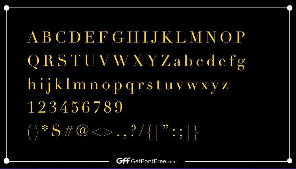
Didot Font is known for its distinctive features and characteristics that contribute to its elegant and sophisticated aesthetic. Some of the key features of Didot Font include:
- Calligraphic Style: Didot Font is influenced by calligraphy, with its thin, delicate strokes and flowing curves that give it a sense of hand-drawn elegance. The typeface exhibits a high contrast between thick and thin strokes, with the vertical lines being much thicker than the horizontal strokes, creating a dramatic and stylish appearance.
- Elegant Curves: Didot Font’s letterforms are characterized by graceful and elongated curves, with tapered terminals and fine serifs that add to their refined appearance. The curves in Didot Font are smooth and carefully crafted, lending it an air of sophistication and elegance.
- High Contrast: One of the defining characteristics of Didot Font is its high contrast between the thick and thin strokes. The thick vertical lines and thin horizontal strokes create a sharp contrast that contributes to its dramatic and eye-catching look, making it ideal for use in display and headline typography.
- Geometric Shapes: Didot Font features clean and precise geometric shapes, with letters that are constructed using straight lines, arcs, and circles. This geometric quality gives the typeface a modern and contemporary feel, while still retaining its classic elegance.
- Serif Design: Didot Font is a serif typeface, which means it has small decorative strokes, or serifs, at the ends of the letterforms. The serifs in Didot Font are thin and fine, adding to their refined appearance and providing a sense of stability and balance to the overall design.
- Vertical Stress: Didot Font exhibits vertical stress, which means that the main strokes of the letters are mostly vertical, giving it a tall and upright appearance. This vertical stress contributes to its formal and dignified look, making it suitable for use in prestigious and sophisticated design projects.
Overall, Didot Font is characterized by its calligraphic style, elegant curves, high contrast, geometric shapes, serif design, and vertical stress. These features combine to create a typeface that exudes a sense of refinement, sophistication, and timeless elegance, making it a popular choice for a wide range of design applications.
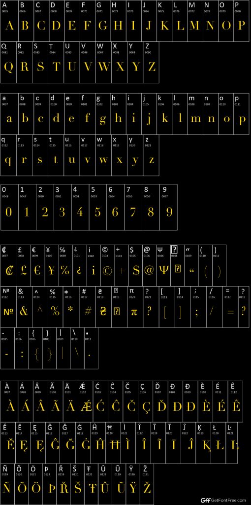
Character Map
Comparison
Didot Font has unique qualities and strengths that set it apart from other similar fonts. Here are some points of comparison:
- High Contrast: One of the distinctive features of Didot Font is its high contrast between thick and thin strokes, which gives it a dramatic and eye-catching look. This high contrast sets it apart from other fonts that may have lower contrast, and it makes Didot Font well-suited for use in display and headline typography where a bold and impactful appearance is desired.
- Calligraphic Style: Didot Font is influenced by calligraphy, with its delicate strokes and flowing curves that give it a sense of hand-drawn elegance. This calligraphic style sets it apart from other fonts that may have more geometric or industrial designs, and it lends Didot Font a sense of sophistication and refinement.
- Elegant Curves: The graceful and elongated curves in Didot Font contribute to its refined appearance and distinguish it from fonts with more angular or boxy letterforms. The smooth and carefully crafted curves of Didot Font add a sense of elegance and grace to its overall design.
- Vertical Stress: Didot Font exhibits vertical stress, with the main strokes of the letters being mostly vertical. This vertical stress sets it apart from fonts with slanted or italicized designs, and it gives Didot Font a tall and upright appearance that conveys a formal and dignified impression.
- Serif Design: Didot Font is a serif typeface, with thin and fine serifs that add to its refined appearance. This serif design distinguishes it from sans-serif fonts, and it gives Didot Font a classic and timeless look that is well-suited for projects that require a sophisticated and elegant aesthetic.
- Versatility: While Didot Font is often associated with luxury and high-end design, it is also a versatile typeface that can be used in various design applications. Its clean and modern geometric shapes, combined with its calligraphic style, make it suitable for both traditional and contemporary designs, giving it a wide range of creative possibilities.
In summary, Didot Font stands out from other similar fonts due to its high contrast, calligraphic style, elegant curves, vertical stress, serif design, and versatility. Its unique qualities and strengths make it a popular choice for projects that require a refined, sophisticated, and impactful typographic appearance.
Didot Font Family
The Didot Font family includes a total of several typefaces, which may vary depending on the specific version or foundry. However, the standard Didot Font family typically includes a range of typefaces with different weights (such as regular, bold, italic, and bold italic), as well as various styles or variations (such as condensed or extended) that offer additional design options. The exact number of typefaces in the Didot Font family may vary, but it generally includes a comprehensive set of typefaces that cater to different design needs and allow for creative versatility in various typographic applications.
Alternatives of Didot Font
There are several alternative fonts that share similar characteristics and styles with Didot Font, offering similar design aesthetics. Some popular alternatives to Didot Font include:
- Bodoni: Bodoni is a classic serif typeface that is known for its high contrast between thick and thin strokes, similar to Didot Font. It has a sleek and elegant appearance with refined curves and vertical stress, making it suitable for elegant and sophisticated designs.
- Walbaum: Walbaum is another serif typeface that shares similarities with Didot Font. It features high contrast, calligraphic influences, and delicate curves, making it a popular choice for projects that require a sense of elegance and refinement.
- Garamond: Garamond is a classic serif font that has a more subtle contrast compared to Didot Font. It is known for its timeless and graceful design with slender serifs and delicate curves, giving it a refined and sophisticated appearance.
- Sabon: Sabon is a serif typeface that combines classic elements with a more modern touch. It has vertical stress, elegant curves, and a harmonious design that makes it suitable for both traditional and contemporary projects.
- ITC Giovanni: ITC Giovanni is a contemporary serif font that is influenced by Didot Font. It features high contrast, calligraphic-inspired letterforms, and a refined appearance, making it a good alternative for projects that require a modern and sophisticated look.
- Playfair Display: Playfair Display is a free Google font that shares similarities with Didot Font. It has a high-contrast design, elegant curves, and a sophisticated appearance that makes it suitable for various design applications.
These are just a few examples of alternative fonts that share similarities with Didot Font. Depending on the specific design requirements and desired aesthetic, there are many other serif fonts available that can be used as alternatives to Didot Font in different design projects.
Tips and Tricks
Here are some tips and tricks for using Didot Font effectively in your design projects:
- Pairing with complementary fonts: Didot Font is an elegant and sophisticated typeface that can be paired effectively with complementary fonts to create visually appealing designs. Consider pairing it with sans-serif fonts for a modern and minimalistic look, or with other serif fonts for a classic and timeless design. Experiment with different font combinations to find the perfect pairing that complements the overall aesthetic of your design.
- Using for specific design projects: Didot Font is particularly well-suited for projects that require a touch of elegance and refinement, such as wedding invitations, formal invitations, high-end branding, and editorial designs. It can also work well in fashion-related designs, luxury packaging, and other projects where a sense of sophistication is desired.
- Choosing the right size and color: When using Didot Font, it’s important to consider the appropriate size and color for optimal legibility and visual impact. Didot Font tends to have delicate strokes and fine details, so it’s important to use it at a size that is large enough to ensure readability, especially in smaller text or body copy. Additionally, consider the color contrast between the text and the background to ensure readability and visual harmony in your design.
- Paying attention to spacing and kerning: Didot Font has a distinct design with elegant curves and serifs, so paying attention to spacing and kerning is crucial for a polished and professional look. Make sure to adjust the spacing between letters (kerning) and words (tracking) to achieve balanced and visually pleasing typography.
- Experimenting with variations: Didot Font often comes with different weights, styles, and variations, such as italic, bold, condensed, or extended. Experiment with these variations to create different visual effects and achieve the desired tone or mood in your design. However, be mindful of maintaining consistency and coherence throughout your design by using variations that complement each other.
- Consider the context and target audience: As with any design decision, consider the context and target audience of your project when using Didot Font. Its elegant and sophisticated style may not be suitable for every design project or target audience. Always ensure that the font choice aligns with the overall brand identity, message, and intended audience of your design.
By following these tips and tricks, you can effectively use Didot Font in your design projects to create visually appealing and impactful designs that convey a sense of elegance and refinement. Remember to always experiment and iterate to achieve the best results for your specific design needs.
License information
The specific license information for Didot Font may vary depending on the source or foundry from which it is obtained. It is important to always review and adhere to the license agreement provided by the font’s creator or distributor to ensure compliance with their terms and conditions. In general, fonts are subject to copyright protection, and the use of a font may be restricted to certain purposes or require proper licensing.
Some common types of font licenses include:
- Desktop License: This type of license allows you to install and use the font on a specific number of desktop computers for a specific number of users. It typically restricts the use of the font for personal or commercial projects but may have limitations on the number of end products or the number of users who can access the font.
- Web License: This type of license allows you to use the font on websites or web applications. It may have restrictions on the number of page views, domain names, or unique visitors.
- App License: This type of license allows you to use the font in mobile applications or other software applications. It may have limitations on the number of downloads, installations, or platforms where the font can be used.
- Server License: This type of license allows you to install and use the font on a server for generating dynamic content or serving web fonts. It may have restrictions on the number of requests, domains, or users.
- Commercial Use License: This type of license allows you to use the font for commercial projects, such as branding, advertising, or product packaging. It may have limitations on the number of end products or the type of usage.
It’s important to carefully review and comply with the terms and conditions of the specific license associated with Didot Font or any other font you use in your projects to ensure proper usage and avoid copyright infringement. Always consult the license agreement provided by the font’s creator or distributor for accurate and up-to-date information on the permitted uses and restrictions of the font.
Supported Languages
Didot Font, like many other fonts, generally supports a wide range of languages for typesetting. The exact list of supported languages may vary depending on the specific variant or version of Didot Font, as well as the character sets included in the font files.
Typically, Didot Font supports English and other major European languages, such as French, German, Spanish, Italian, and many others. It may also support Latin-based languages, Cyrillic-based languages, and other scripts or writing systems, depending on the specific design and features of the font.
It’s important to note that not all fonts support all languages or writing systems equally well. Some fonts may have limited support for certain languages or may not include all the necessary characters or diacritics for specific languages. Before using Didot Font or any other font for a specific language, it’s recommended to check the font’s documentation or character set to ensure that it supports the necessary language or script requirements for your particular design or project.
FAQs
Q: What is Didot Font?
A: Didot Font is a typeface that is known for its elegant and modern style, characterized by thin, high-contrast strokes and a refined appearance. It is often used for high-end design projects that require a sophisticated and classic look.
Q: Who designed Didot Font?
A: Didot Font was designed by a prominent French typeface designer, Firmin Didot, in the late 18th century. The Didot family was well-known for their contributions to typography and printing during the Enlightenment era.
Q: What is the history of Didot Font?
A: Didot Font has a rich history that dates back to the late 18th century when Firmin Didot and his family designed and printed many notable works, including books, newspapers, and other printed materials. Since then, Didot Font has become a classic and enduring typeface that is still widely used in modern design today.
Q: What are the common uses of Didot Font?
A: Didot Font is often used in high-end design projects that require a refined and sophisticated look, such as wedding invitations, greeting cards, posters, logos, and other print or digital materials. It is also commonly used in fashion, luxury branding, and editorial design.
Q: What are the unique features of Didot Font?
A: Didot Font is known for its calligraphic style, with thin, high-contrast strokes, elegant curves, and a modern appearance. It features long ascenders and descenders, and its uppercase letters are characterized by their vertical stress and thin serifs, while the lowercase letters are often delicate and slimmer.
Q: Can Didot Font be used for commercial projects?
A: The usage of Didot Font for commercial projects may require proper licensing. It’s important to review and adhere to the license agreement provided by the font’s creator or distributor to ensure compliance with their terms and conditions. Some licenses may have restrictions or limitations on the commercial usage of the font, so it’s important to carefully review and comply with the license terms.
Q: Does Didot Font support multiple languages?
A: Yes, Didot Font generally supports a wide range of languages for typesetting, including English, French, German, Spanish, Italian, and many other European and Latin-based languages. It may also support Cyrillic-based languages and other scripts, depending on the specific variant or version of the font.
Q: Can Didot Font be used in web design?
A: Yes, Didot Font can be used in web design, but it may require a specific web license that allows for the embedding of fonts in websites or web applications. It’s important to review and comply with the license agreement provided by the font’s creator or distributor for web usage, including any limitations on page views, unique visitors, or other usage restrictions.
Q: Can Didot Font be used for logo design?
A: Yes, Didot Font can be used for logo design, as it is often chosen for its elegant and refined appearance. However, it’s important to ensure that the usage of the font in a logo design complies with the font’s license agreement and to consider factors such as legibility, scalability, and brand identity when using the font in a logo design.
Q: How to pair Didot Font with other fonts?
A: Didot Font can be effectively paired with other complementary fonts to create visually appealing and harmonious designs. For example, it can be paired with sans-serif fonts for a modern and clean look, or with serif fonts for a more classic and traditional aesthetic. It’s important to consider factors such as contrast, size, and spacing when pairing fonts to ensure a balanced and visually pleasing design.