
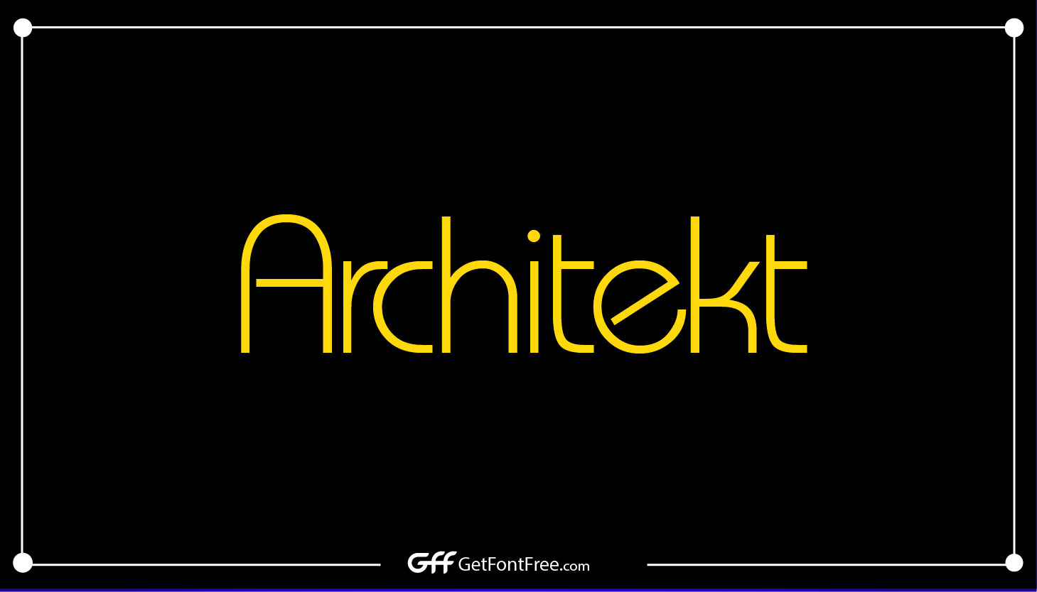
Architekt Font is a contemporary and geometric typeface that offers a clean and modern aesthetic. It was designed by Måns Grebäck and published by Aring Typeface AB. The font was first released in 2008.

Basic Info Table of Architekt Font
| Name | Designer | Foundry | Style | File Format | Date Released | License | Type |
|---|---|---|---|---|---|---|---|
| Architekt Font | Måns Grebäck | Aring Typeface AB | Geometric | TTF, OTF | 2008 | Free for personal use | Sans-serif |
Reason to Use Architekt Font
- Geometric Design: Architekt Font’s geometric structure and clean lines make it an excellent choice for designs that require a modern and sleek look. Its precise and balanced forms add a professional touch to any project.
- Versatility: Architekt Font is highly versatile and suitable for a wide range of design applications, including branding, advertising, packaging, and web design. It can be used for both headlines and body text.
- Legibility: The font’s clarity and legibility make it readable even at smaller sizes. Whether used in print or digital media, Architekt Font ensures that your message is easily conveyed to the audience.
- Contemporary Appeal: Architekt Font’s contemporary and minimalist aesthetic aligns well with current design trends. It imparts a sense of modernity and sophistication to your designs.
Architekt Font Family
The Architekt Font family offers several styles and weights, providing designers with flexibility and creative options. The family includes Regular, Bold, Italic, and Bold Italic variations, allowing for various typographic hierarchies and design needs.

Alternatives of Architekt Font
- Nexa: Nexa, designed by Fontfabric, is a popular alternative to Architekt Font. It features a geometric design with clean lines and comes in various weights, making it suitable for both display and text use.
- Proxima Nova: Created by Mark Simonson, Proxima Nova is a versatile typeface known for its modern appearance and extensive family. It offers a wide range of weights and styles, making it a reliable alternative to Architekt Font.
- Gotham: Gotham Font, which we discussed earlier, is another alternative to Architekt Font. Both typefaces share a clean and contemporary aesthetic, making Gotham a suitable choice for projects that require a similar style.
- Montserrat: Montserrat, designed by Julieta Ulanovsky, is a popular font inspired by the signage of the Montserrat neighborhood in Buenos Aires. It features a geometric design and is available in various weights, making it a versatile alternative to Architekt Font.
- Bebas Neue: Bebas Neue, designed by Ryoichi Tsunekawa, is a free font known for its bold and uppercase design. While it has a distinct style compared to Architekt Font, it can be a suitable alternative for projects that require a strong visual impact.
Tips and Tricks for Using Architekt Font
- Contrast with Serif Fonts: Pair Architekt Font with a serif font to create an appealing contrast. The combination of a geometric sans-serif with a more traditional serif typeface can add visual interest and create a balanced design.
- Use Hierarchy: Take advantage of Architekt Font’s different weights and styles to establish a clear typographic hierarchy in your designs. Utilize bolder weights for headlines and lighter weights for body text to create a sense of visual distinction.
- Experiment with Kerning: Adjust the spacing between letters (kerning) to ensure optimal readability and visual harmony. Pay attention to the spacing between specific letter combinations and adjust as necessary.
- Maintain Ample White Space: Architekt Font’s clean and minimalist design is best complemented by ample white space. Avoid overcrowding your designs and allow the font’s shapes to breathe for a more impactful visual effect.
- Consider Context and Purpose: When using Architekt Font, consider the context and purpose of your design. Its modern and sleek appearance is well-suited for contemporary and professional projects, but may not be the best choice for designs with a more vintage or decorative aesthetic.
- Test for Readability: Before finalizing your designs, test the readability of Architekt Font across different mediums and sizes. Ensure that the font maintains its legibility and clarity on both print and digital platforms.
- Align with Branding Guidelines: If you’re using Architekt Font for branding purposes, ensure that it aligns with the overall branding guidelines and conveys the desired brand personality and image.
License Details
The specific license details for Architekt Font can be found on the official website of Aring Typeface AB or authorized font distributors. It is important to review and comply with the license terms and conditions to ensure proper usage and avoid any copyright infringement.
Download Architekt Font Free
To download the Architekt Font for free, visit the official website of Aring Typeface AB or authorized font distributors. Look for the download button or link associated with Architekt Font and follow the provided instructions. Thank you.
Character Map
The character map for Architekt Font displays the available characters, symbols, and glyphs included in the font. It is a useful reference for designers when exploring the range of typographic elements offered by the font.

Usage
- Branding and Logo Design: Architekt Font’s modern and sleek design makes it an excellent choice for branding and logo design. It can effectively represent a wide range of industries, from technology and architecture to fashion and lifestyle.
- Editorial Design: Architekt Font’s legibility and contemporary appeal make it suitable for various editorial design applications, such as magazines, newspapers, and books. Its clean lines and balanced proportions ensure an enjoyable reading experience.
- Web Design: Architekt Font can be used in web design to create clean and modern interfaces, headers, and navigational elements. Its versatility and readability make it suitable for both desktop and mobile displays.
- Packaging Design: The clean and professional look of Architekt Font lends itself well to packaging design. It can be used for product names, descriptions, and other typographic elements to create a cohesive and visually appealing packaging concept.
- Advertising and Marketing Materials: Whether it’s brochures, posters, or digital advertisements, Architekt Font can effectively convey information and grab attention. Its contemporary aesthetic helps deliver a modern and sophisticated message to the audience.
- Signage and Wayfinding: Architekt Font’s legibility and geometric forms make it suitable for signage and wayfinding systems. Its clarity ensures that information is easily understood and navigated in public spaces.
- UI/UX Design: Architekt Font’s modern and clean design can be applied to user interface (UI) and user experience (UX) design projects. Its legibility and versatility make it a reliable choice for creating visually appealing and user-friendly interfaces.
Supported Languages
Architekt Font supports a wide range of languages, including but not limited to English, Spanish, French, German, Italian, Portuguese, Russian, and more. Its character set includes diacritics and symbols necessary for multilingual typography. Refer to the font documentation for a complete list of supported languages.

Conclusion
Architekt Font, designed by Måns Grebäck, offers a contemporary and geometric design that adds a sleek and modern touch to various design projects. With its clean lines, versatility, and excellent readability, it is well-suited for branding, editorial design, web design, packaging, advertising, signage, and more. By understanding its features, utilizing its various weights and styles, and exploring its alternatives, designers can make the most of Architekt Font to create visually striking and effective designs.
FAQs
Can I use Architekt Font for commercial projects?
Yes, Architekt Font can be used for commercial projects. However, it is important to review and comply with the specific license terms and conditions to ensure proper usage.
Are there web font versions available for Architekt Font?
Yes, web font versions of Architekt Font are available. These versions are optimized for web use and can be easily integrated into websites.
Can I modify Architekt Font for my project?
Modifying the font is generally not allowed without proper licensing or permission from the font designer or foundry. It is best to consult the license details and seek appropriate authorization if modifications are required.
Where can I purchase the full Architekt Font family?
The full Architekt Font family can be purchased from the official website of Aring Typeface AB or authorized font distributors. Check their website for pricing and purchasing options.
Does Architekt Font support special characters and symbols?
Yes, Architekt Font supports special characters, symbols, and diacritics necessary for multilingual typography. Refer to the font documentation or character map for a complete list of supported characters.
Can Architekt Font be embedded in PDF documents?
Embedding fonts in PDF documents depends on the specific license and embedding permissions. Review the license details and consult the font distributor or foundry for guidance on embedding Architekt Font in PDFs.
Can I use Architekt Font on multiple computers?
The license terms may vary, but typically, fonts can be installed on multiple computers as long as they are used by the same licensed user or within the licensed organization. Refer to the specific license details for more information.