

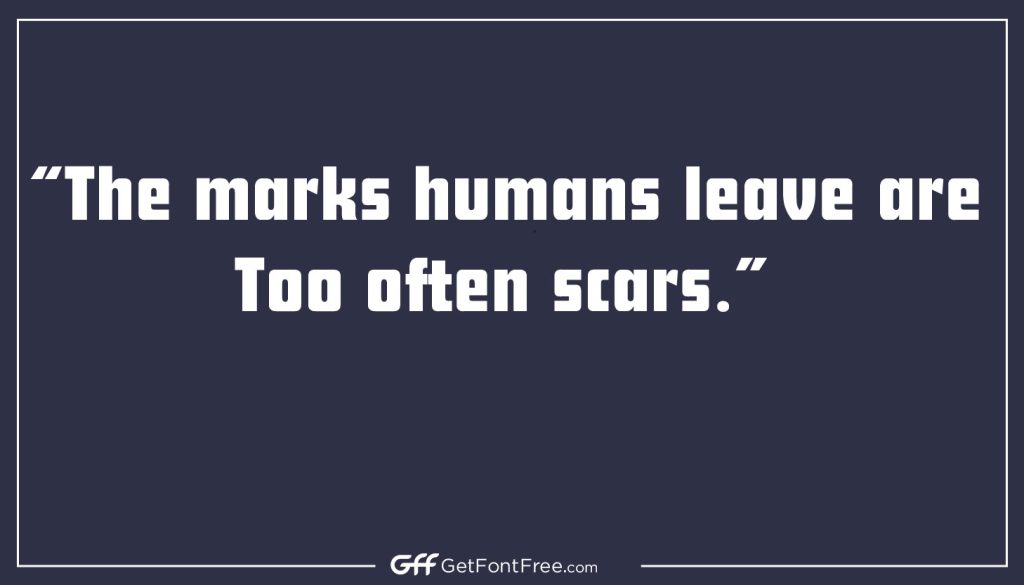
Futura Font is a geometric sans-serif typeface designed by Paul Renner in 1927. It is widely considered one of the most influential typefaces of the 20th century and has been used in countless applications, from corporate branding to book covers to movie posters. Renner designed Futura as a response to the ornate, decorative typefaces that were popular in the early 20th century.
He wanted to create a font that was simple, modern, and functional, with a focus on legibility and clarity. The result was a typeface with clean lines, geometric shapes, and minimal ornamentation. Futura’s popularity grew rapidly, especially in the 1920s and 1930s, when it became closely associated with the modernist movement in art and design. It was used extensively in the design of the Bauhaus school in Germany, as well as in the work of artists and designers such as Herbert Bayer, Jan Tschichold, and Theo van Doesburg.
Over the years, Futura has been adapted and modified by various designers and foundries, but it remains a popular and influential typeface to this day. Its clean, modern look continues to inspire designers in a wide range of fields, and it has been used in everything from logos to street signs to space exploration missions.
Futura Font Information
| Name | Designer | Foundry | Style | File Format | Date Released | License | Type |
|---|---|---|---|---|---|---|---|
| Futura | Paul Renner | Various | Geometric | OTF, TTF | 1927 | Proprietary | Sans-serif |
Use cases
Futura is a versatile typeface that has been used in a wide range of applications. Some of the most common uses for Futura include:
- Logos and branding: Futura’s clean, modern look makes it a popular choice for corporate logos and branding. It has been used by companies such as Volkswagen, Louis Vuitton, and Calvin Klein.
- Print and digital advertising: Futura is often used in print and digital advertising, particularly for products or services that have a modern or minimalist aesthetic.
- Editorial design: Futura’s legibility and simplicity make it well-suited for use in editorial design, including books, magazines, and newspapers.
- Web design: Futura is a popular choice for web design, particularly for sites that have a modern or minimalist design.
- Posters and flyers: The bold, geometric shapes of Futura make it an effective choice for posters and flyers, particularly for events or products that have a modern or edgy aesthetic.
- Packaging design: Futura’s clean lines and minimalist look make it a popular choice for packaging design, particularly for high-end or luxury products.
- Fashion design: Futura’s association with modernity and sophistication has made it a popular choice in fashion design, particularly for high-end brands.
- Wedding invitations and greeting cards: Futura’s simple, elegant look makes it a popular choice for wedding invitations and greeting cards, particularly for couples or individuals who want a modern and minimalist design.
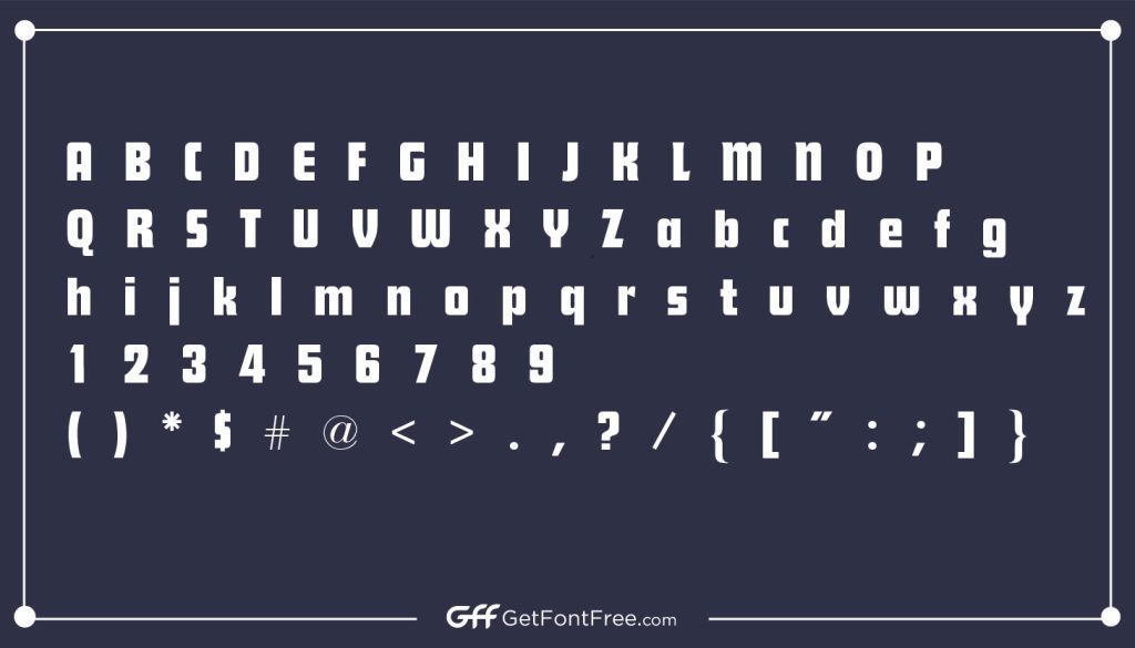
Characteristics
Futura is a geometric sans-serif typeface that is characterized by its clean lines, simple shapes, and minimalist design. Some of its key features and characteristics include:
- Geometric shapes: The letters in Futura are based on geometric shapes, such as circles, squares, and triangles. This gives the typeface a uniform, structured look.
- Even stroke weight: The stroke weight (thickness of the lines) in Futura is consistent throughout each letter, giving it a balanced and harmonious appearance.
- Minimal ornamentation: Futura has very little ornamentation, with simple curves and angles replacing traditional serifs and other embellishments.
- Open counters: The spaces inside letters, known as counters, are open and generous in Futura. This enhances legibility and gives the typeface a clean, modern look.
- Variety of weights: Futura is available in a range of weights, from light to bold, making it a versatile typeface for a variety of applications.
- Large x-height: The x-height (the height of the lowercase letters) in Futura is relatively large, which helps to enhance legibility and make the typeface more readable at smaller sizes.
- Modernist aesthetic: Futura was designed in the early 20th century, during the modernist movement in art and design. As such, it has a distinctly modern and minimalist aesthetic that has influenced countless designers in the years since its creation.
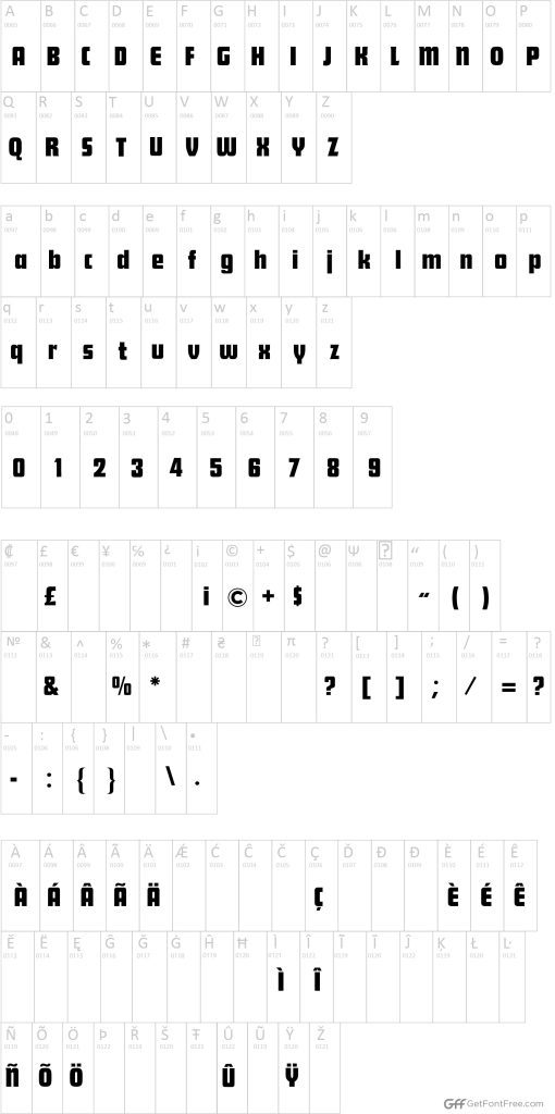
Character Map
Comparison
Futura is a distinctive typeface with a unique set of qualities and strengths that set it apart from other similar fonts. Here are some comparisons between Futura and other popular sans-serif typefaces:
- Helvetica: Helvetica is a widely-used sans-serif typeface that shares some similarities with Futura, including its clean lines and even stroke weight. However, Futura has a more geometric look, with more defined shapes and angles. Futura also has a larger x-height, making it more legible at small sizes.
- Avenir: Avenir is another popular sans-serif typeface that has a modern, clean look. Like Futura, it has a large x-height and open counters, but it has a slightly more organic feel, with more curved lines and less emphasis on geometric shapes.
- Gotham: Gotham is a sans-serif typeface that is known for its clean, modern look and its versatility. While Gotham has a similar weight distribution to Futura, it has a more condensed feel, with tighter spacing between letters. Futura, on the other hand, has more generous spacing and a more open feel overall.
- Univers: Univers is a sans-serif typeface that was designed in the same era as Futura, and it shares some similarities in terms of its modernist aesthetic. However, Univers has a more traditional feel, with more curved lines and more traditional serifs. Futura, by contrast, has a more geometric look and a more minimalist design.
Futura Font Family Includes a Total of Typefaces
The Futura font family includes a total of 22 typefaces, which vary in weight and style. Here is a list of the different typefaces in the Futura family:
- Futura Light
- Futura Light Italic
- Futura Book
- Futura Book Italic
- Futura Medium
- Futura Medium Italic
- Futura Bold
- Futura Bold Italic
- Futura Extra Bold
- Futura Extra Bold Italic
- Futura Condensed Light
- Futura Condensed Light Italic
- Futura Condensed Book
- Futura Condensed Book Italic
- Futura Condensed Medium
- Futura Condensed Medium Italic
- Futura Condensed Bold
- Futura Condensed Bold Italic
- Futura Display Light
- Futura Display Medium
- Futura Display Bold
- Futura Display Extra Bold
Alternatives of Futura Font
While Futura is a popular and versatile typeface, there are a number of alternatives that designers may consider using for their projects. Here are some alternatives to Futura:
- Proxima Nova: Proxima Nova is a modern sans-serif typeface that has a similar geometric feel to Futura, with a large x-height and open counters. It is available in a range of weights and styles, making it a versatile option for a variety of design applications.
- Montserrat: Montserrat is a free, open-source typeface that was inspired by the urban typography of Buenos Aires in the 20th century. It has a similar minimalist feel to Futura, with a range of weights and styles that can be used for everything from headlines to body text.
- Avenir: Avenir is a popular sans-serif typeface that has a clean, modern look. Like Futura, it has a large x-height and open counters, but it has a slightly more organic feel, with more curved lines and less emphasis on geometric shapes.
- Gotham: Gotham is a sans-serif typeface that has a modern, clean look and a wide range of weights and styles. It is known for its versatility and is a popular choice for branding and editorial design.
- Circular: Circular is a geometric sans-serif typeface that was designed specifically for use in digital environments. It has a clean, modern look and is available in a range of weights and styles.
Tips and Tricks
Here are some tips and tricks for using Futura Font effectively in your design projects:
- Pair it with other fonts: While Futura is a versatile typeface that can stand on its own, it can also be paired with other complementary fonts to create a more dynamic and interesting design. Consider pairing it with a serif font for a more traditional look, or a script font for a more playful feel.
- Use it for specific design projects: Futura is a great choice for a variety of design projects, including branding, editorial design, and packaging. Its clean lines and geometric shapes make it a popular choice for modern and minimalist designs.
- Choose the right size: When using Futura, it’s important to choose the right size for your text. Its large x-height makes it legible at smaller sizes, but it can also be effective at larger sizes for headlines and display text. Experiment with different sizes to find the right balance for your design.
- Choose the right color: The color of your text can have a big impact on the overall look and feel of your design. For a classic and timeless look, consider using Futura in black or white. For a more modern and playful feel, experiment with brighter colors and bold combinations.
- Use it sparingly: While Futura is a great typeface, it’s important not to overuse it in your design. Using it too much can make your design feel repetitive and boring. Consider using it for headlines or key elements, and pairing it with other fonts for body text and other elements.
Supported Languages
Chuvash, Cimbrian, Corsican, Croatian, Cyrillic, Czech, Danish, Dungan, Dutch, English, Esperanto, Estonian, Evenki (Cyrillic), Faroese, Fijian, Finnish, French, French Creole (Saint Lucia), Frisian, Friulian, Galician, Genoese, German, Gilbertese (Kiribati), Uyghur (Latinized), Uzbek (Cyrillic), Veps, Vietnamese.
Conclusion
In conclusion, Futura Font is a versatile and elegant typeface that has been popular with designers for nearly a century. Its clean lines, geometric shapes, and large x-height make it a popular choice for a variety of design applications, from branding to editorial design to packaging. The Futura family includes 22 typefaces, which vary in weight and style, allowing for a wide range of design possibilities. While there are many alternatives to Futura, it remains a popular choice for designers who appreciate its versatility and timeless elegance. To use Futura effectively, consider pairing it with other fonts, choosing the right size and color, and using it sparingly for maximum impact. Overall, Futura Font is a classic and versatile typeface that can elevate any design project.
FAQs
Who designed Futura Font?
Futura Font was designed by Paul Renner, a German typeface designer, in the 1920s.
What is the style of Futura Font?
Futura is a geometric sans-serif typeface, with clean lines and simple shapes that give it a modern and minimalist feel.
What are the most common uses for Futura Font?
Futura is a versatile typeface that can be used for a variety of design projects, including branding, editorial design, packaging, and signage.
What are some alternatives to Futura Font?
Some alternatives to Futura Font include Proxima Nova, Avenir, Gotham, Montserrat, and Circular.
What file formats are available for Futura Font?
Futura Font is available in a range of file formats, including OpenType, TrueType, and PostScript.
Can I use Futura Font for commercial projects?
Yes, Futura Font is available for commercial use. However, it’s important to check the licensing agreement to ensure that you’re using it legally.
How do I choose the right size and weight for Futura Font?
Choosing the right size and weight for Futura Font depends on the specific design project and the intended use of the text. Experiment with different sizes and weights to find the right balance for your design.